Starting your own business forces you to explore every inch of your creative genius and miraculously make it all ebb and flow together. Everyone has grand ideas for their business, and we would all love to hire the best designers out there to make that all happen.
As a designer myself, you realize the importance of hiring a professional to, well, make it look like a professional helped you. When I look at a landscape, I can automatically tell who had a professional design their space, and who picked up the 10 random plants that were on sale at the grocery store and plunked them into their garden. I can see the value in that professionalism, and I wanted my clients to see the same. So many customers will try to tackle their garden, year after year, thinking, “hey, I can do this…flowers are already pretty, the garden will just design itself….” They will finally reach a breaking point, come home one day, and realize, “this looks ridiculous.”
In the past, I had worked with a web developer, who came up with a logo design and, quite a pretty website actually. But, the logo was a simple clipart, generic, (a tropical leaf to boot – not exactly Canadian) and really didn’t represent who I was. But, who’s kidding who, I didn’t know who I was. It got me by for a few years, and then, it time to change things up. This time I used 99designs, which is a pretty cool concept. It’s a contest for freelance graphic designers all over the world, and you put up a bid (or how much you’re willing to spend), give them a few parameters, background on your business, etc., and a bunch of designers will go to work and come up with logo concepts. You provide feedback, and the designers will keep going until you are happy, and then get paid for their work. I used this logo, built my own documents like invoices and proposals, and patched everything together to try to make it jive. I saw a commercial for Wix with Heidi Klum and how easy it was for HER to build her FREE website from scratch and have it look STUNNINGLY professional (hehe they’ll never know..)… I spent a good 2 solid weeks building this website, which was quite easy when you got the hang of it, but it wasn’t entirely mobile friendly and I made some mistakes and it showed. It got me by for a year, but it just wasn’t good enough. Next platform, Squarespace. Now I have really nothing bad to say about Squarespace. Their templates are super easy, even easier to build, but I was feeling like things were still quite hodgepodge. I had a logo that was less than average, a website that was nice but didn’t reflect any sort of brand, and basically just lacked cohesion across the board. I just wasn’t feeling complete. My clientele was growing, and I wanted to create a brand that better showcased who I am, and who I want to work with.
I started my new branding journey well over a year ago. Researching companies, everywhere. Most of what I saw was typical for “landscapers”, very commercial. I didn’t want to be typical. I found a company in California, and I was in love. Their work was pretty, unique, and I was sold. It was an investment for me, which is a hard pill to swallow for an up and comer with no money. But I knew that it was time to put my big girl pants on and do this. I put up half the money, saw the concepts, and was quite disappointed. Even more disappointed when they weren’t willing to hear my feedback and make some changes. It was their way or the highway. I was out my investment with nothing to show for it. It was like a bad break up; I needed time to heal before I even thought about moving on to the next.
I kept researching companies in the meantime, everywhere. I contacted companies to inquire about hiring them, was even ready to sign up with another, but many were lacking the customer service that anyone would expect or hope for. It was incredibly discouraging. I wanted to throw in the towel, yet again. Who knew this would be so hard?!?
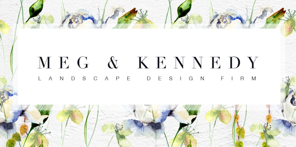
I pumped the brakes. I was still lacking vision in what was important and what wasn’t. I didn’t want to make another costly mistake. I hired a business consultant named John Holland at Plutus Consulting and he took me back to the basics. The vision I had, and where I needed to go. He corralled my craziness, was the sounding board I needed, and got me on track. If we were tackling a re-brand, then name analysis came into the mix as well. We decided that a name change was in order. I liked my name, but not everyone ‘got it’. People were unsure if I did interiors or exteriors, and I needed to be rid of that confusion. We interviewed a couple local companies, but they were still offering the “typical”. I knew I wanted to market more to women, as they are usually the ones driving home renovations these days. I wanted to make them feel comfortable approaching me, and not feel railroaded by that typical, burly intimidating landscaper telling them what they think they should be doing with their own backyard. I knew I needed something clean, classic, professional and pretty. I googled “female branding companies Canada”. And that’s when I found Oliver & Spence. A creative agency out of Calgary (ok they weren’t local) but I loved what I saw.


 After asking all the questions I should’ve asked with the 1st company, I felt at ease. And it’s been nothing but stellar customer service and creative ideas since I signed up. Kim and Jay have gone over and above to keep me happy to this day, and I couldn’t be more appreciative.
I am so thrilled to launch my new name & new brand, as business continues to grow and I can provide my awesome clients with the company they deserve to work with.
